Looking at different illustrator designs
This is my first attempt at my design using illustrator. I am pleased with the outcome but think it needs improving still. It seems to be missing something. I will look at other images from similar styles to get inspiration to come up with my own style.

All of the designs below have a different style to one another. the thing I have noticed on all of them which i don't have is detail. Event the simplest of detail helps make the image come to life. I need to zoom into my image and add more detail to make it more realistic. Also the edges are too straight on my image, nothing would look like this in real life.
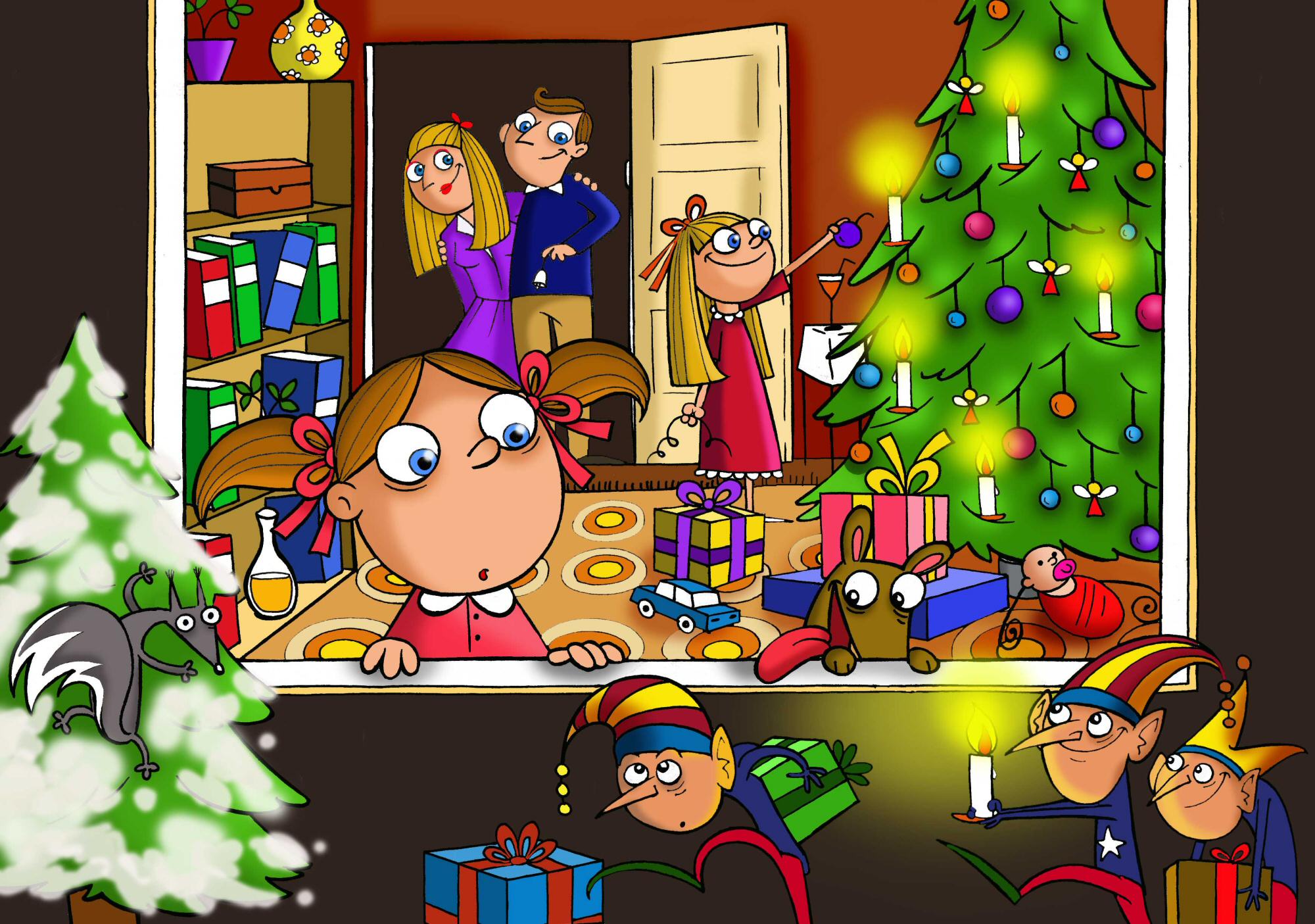
This Image has very bright colours. This makes it appeal to children.They have used shading on the images which helps add a depth of field.

This image is very detailed making it look more life like than the image above. this isnt the type of style I would go for but it helps to look at different styles.

This image is very scruffy. This has made me realise that my first draft is far too neat. I need to make my edges look more rounded and take off all the straight edges.

This image uses pastel colours giving it a very traditional look and feel. I dont think this would make the most off the high res display on the iPad. My app needs to be bright too show off the high res colours on the ipad.

I have noticed this image does not have heavy outlines. this is one thing i need to change on my image.

The grass in this image as subtle detail. the lines help make the grass look more realistic giving it the feel of a freshly mowed field.
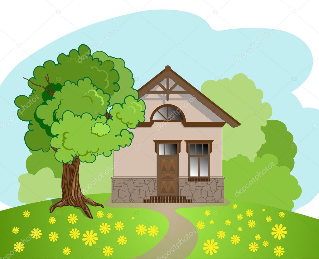
This image shows detail on the tree and grass. this helps separate each part of the image. The path is not straight, it has a curve to it which is more realistic.

This image has shading on the windows and doors. It helps make it look less still.
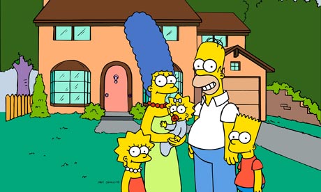
This is a good image to look at because everyone likes the Simpsons. the drawings are simple which little bits of detail. Rich colours are used.

This is a very popular game for mobile phones. I like the use of rich colours and gradients . the main characters have a black outline then the background is more subtle.
No comments:
Post a Comment